Panel 3: charts
Panel 3
Panel #3 (CTRL-G) consolidates data by week and shows them as time series or pie charts.
N.B. Data consolidation is done once per yatish run (to save CPU cycles), that is when panel #3 is first activated: thus one must restart yatish in order to plot data entered since the first switch to panel #3 in the current run.
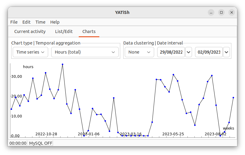
Here is a first example, drawn with the wxFreeChart library:
The various controls allow you to choose (from left to right):
- Chart type:
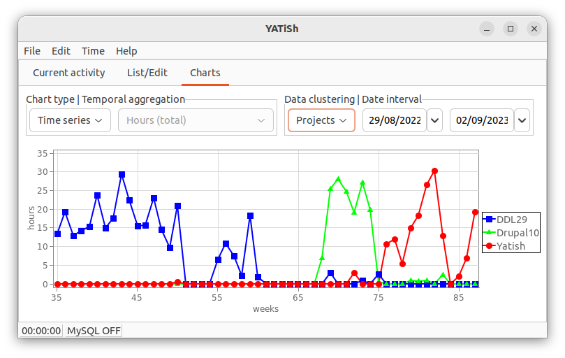
- Time series
- One curve (if data clustering is None, see below) or the three most significant curves (other clustering schemes, see example above).
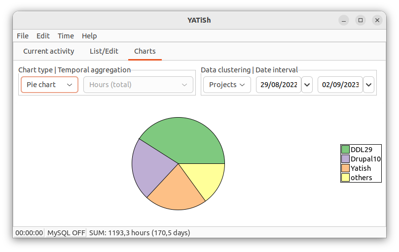
- Pie chart
- One pie chart with up to four sectors: the three largest ones and an others sector adding all the... others. A clustering scheme must be chosen (None is unavailable). The status bar is updated. Here is an example (which is another view of the very same data as above):
- Temporal aggregation: when data clustering is set to None (see below), various weekly consolidations are available to diagnose one's working habits.
- Hours (total)
- Weekly sum of the recorded hours (any activity). There is no other choice when data clustering is not None. Did you work too much? (depending on the labor law in your country ;-)
- Days (worked)
- Number of days with recorded activity, per week. Were you able to save your weekends?
- Time range (max)
- Time lapse between the beginning of the day (start of the earliest activity) and the end of it (stop of the latest one); the maximum (per week) of such work day lengths is shown. Are you able to always disconnect in the evening?
- Minutes/timeslot (average)
- Average duration of the activities, per week. Do you have to continuously switch between (micro)tasks?
- Data clustering: the attibute to analyse when drawing multiple times series, or pie charts. The temporal aggregation is set to Hours (total) except when no (None) clustering is performed (in which case other temporal aggregates become available).
- Clients
- Show the (up to) three largest Clients involved in the selected time period.
- Projects
- Show the (up to) three largest Projects involved in the selected time period.
- Tasks
- Show the (up to) three largest Tasks involved in the selected time period.
- Tools
- Show the (up to) three largest Tools involved in the selected time period.
- None
- Don't distinguish between Clients, Projects, Tasks nor Tools.
- Date interval: modifying the time window has two effects: (i) zoom in/out the horizontal axis of times series and (ii) choose the relevant (multi-)series or sectors to show, i.e. those having the largest totals in the period.
- first day
- When to start computing/plotting. A pop-up menu allows one to select This month or This year.
- last day
- When to stop computing/plotting. A pop-up menu allows one to select Last month or Last year.
Charting libraries
Three third-party toolsets are avalaible in yatish, to be chosen in the Settings:
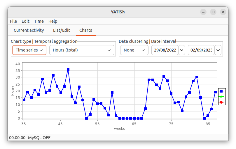
- wxMathPlot: the only library natively using a datetime axis (a home-baked week number is used for the other libraries). There is a context menu and mouse commands to zoom/pan the plot (click right in the graph and experiment). This library, however, does not provide pie charts.
- wxFreeChart: axis labeling is optimized (Talbot et al., IEEE VGTC proceedings, 2010); in the present coding of yatish the legend is always there (empty when no clusters are considered).
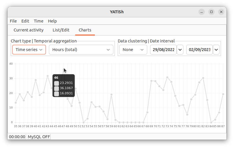
- wxCharts: data values are show under the cursor but axes are not labeled.
Here are examples of the same curve, as rendered by each of the libraries available in yatish (in the same order as the preceeding listing):